⚡ QUICK SUMMARY
Most contractor websites look nice but don't get calls. The difference between a website that works and one that wastes money comes down to four simple things - and none of them are how pretty it looks.
I've looked at thousands of contractor websites since 2013. Plumbers. Roofers. HVAC companies. Electricians. Landscapers. You name it.
And here's what I can tell you. Most of them look fine. Nice logo. Clean layout. Some stock photos of a guy in a hard hat.
But they don't get calls.
The business owner thinks the website is working. But the phone isn't ringing. And they can't figure out why.
Here's the deal. When I look at a contractor's website, I don't care if it looks pretty. I check four things. And within ten seconds, I know if it's making money or burning it.
The First Thing I Check: Does It Tell Me How This Business Makes My Life Better?
This is the big one. And almost nobody gets it right.
Most contractor websites land on a page that says something like "Welcome to ABC Plumbing. We've been serving the community since 1998."
Cool. But the person who just landed on your site doesn't care about your history. They have a busted pipe. Or a broken AC unit. Or a roof that leaks every time it rains.
If your website doesn't tell me how your business makes my life better in the first five seconds - I'm gonna bounce.
Your visitor needs to land on your site and instantly feel like they found the right place. The headline should speak to their problem. Not your company history. Not your awards. Their problem.
"We fix your plumbing fast so you can stop worrying." That works. "Welcome to our website" does not.
The Second Thing: Is There a Clear Phone Number?
This sounds so simple. But you'd be shocked how many contractor websites hide the phone number.
It's buried in the footer. Or it's in tiny text. Or it's on the "Contact" page three clicks deep.
76%
of local service searches happen on a phone
Google / BrightLocal 2026
If someone finds your site on their phone - which most people do - your number needs to be right there. At the top. Big. Easy to tap. One click and they're calling you.
That's it. No hunting. No scrolling. Phone number, top of the page, clickable.
The Third Thing: Is There a Clear Call to Action?
Every visitor who lands on your website is asking one question. "What do you want me to do next?"
If the answer isn't obvious, they leave.
| BAD No CTA Visitor looks around, gets confused, hits the back button |
GOOD Clear CTA "Get Your Free Estimate" button right above the fold |
A great contractor website has one clear action on every page. A button that says "Get Your Free Estimate" or "Call Now" or "Book Your Appointment." Something that tells the visitor exactly what to do if they're ready.
It needs to be above the fold. That means they can see it without scrolling. The second they land on your page - boom - there's the next step.
The Fourth Thing: Does It Load Fast and Look Good on a Phone?
This one is a deal breaker. And it's where most contractors drop the ball.
Here's why. Most contractors built their website on a laptop. Or their web guy showed it to them on a desktop screen. It looked great. They said "looks good, ship it."
But their customers aren't sitting at a desk. They're on their phone at 9pm with a flooded basement. Or on lunch break searching for someone to fix their AC.
💡 Pro Tip
Pull your website up on your phone right now. Can you see the phone number? Can you tap to call? Is the "Get a Quote" button right there? Does it load in under three seconds? If the answer to any of these is no - you're losing customers today.
If your site takes more than three seconds to load, more than half your visitors leave before they ever see your page. That's not a guess. That's data from Google.
And when they do get there, everything needs to work. The phone number needs to be tap-to-call. The CTA needs to be easy to hit with a thumb. The text needs to be big enough to read without zooming in.
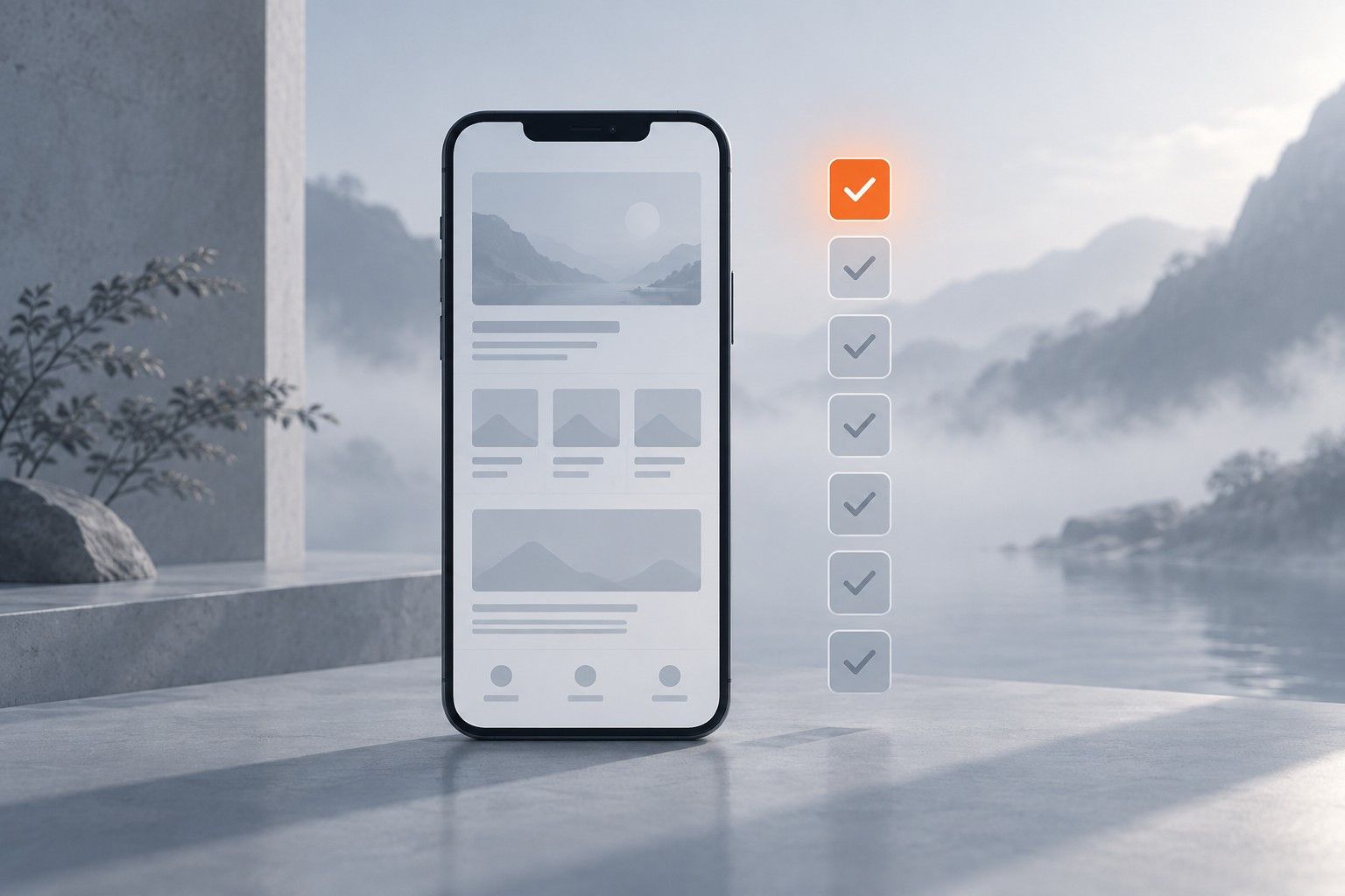
The Four-Point Website Check
Here's your cheat sheet. Check your website for all four of these today.
1 The Headline Test
Does your homepage instantly tell visitors how you make their life better? Not your history. Their result.
2 The Phone Number Test
Can you see the phone number without scrolling? On mobile, can you tap it to call?
3 The CTA Test
Is there a clear button or link telling visitors what to do next? Is it above the fold?
4 The Mobile Speed Test
Pull up your site on your phone. Does it load in under three seconds? Does everything look good and work?
If your site passes all four, you're ahead of most of your competition. If it fails even one, you're losing calls every single day.
The Bottom Line
A great contractor website is not about how it looks. It's about how it works. Does it show the visitor how you help them? Can they call you in one tap? Do they know what to do next? Does it load fast on a phone?
That's it. Four things. Get those right and your website will do what it's supposed to do - get the phone to ring.
I've been doing this since 2013. I've worked with over five thousand service businesses. And the ones with the best websites aren't the ones with the fanciest designs. They're the ones that make it easy for customers to take action.
| See What Customers See When They Find You Your website is often the first impression. We will show you what is working and what is not.
|
Written for contractors, not marketers. What is working in local search and AI right now, in five minutes. No fluff, no spam, unsubscribe anytime.
Connects to QuickBooks Online in one click. Your competitors ask 100% of customers for reviews automatically. Now you can too.
See How It WorksTake the free assessment and get a full report on where your marketing stands and what to fix first.
Start My Free Assessment