⚡ QUICK SUMMARY
Seventy percent of your customers find you on a phone. But most contractor websites were built on a laptop. What shows up above the fold - that first screen before anyone scrolls - decides if they call you or your competitor. This is the audit you need to do today.
Picture this. It's nine thirty on a Tuesday night. A homeowner's kitchen sink just started leaking. Water is going everywhere. She grabs her phone and types "plumber near me."
Your website pops up. Great. But here's the problem.
She's looking at her phone. Not a big laptop screen. Not a desktop monitor. A five-inch phone screen. And whatever shows up in that first view - before she scrolls even once - decides everything.
If she sees a phone number she can tap? She calls you. If she sees a big image and a menu she has to dig through? She's gone. She hits the back button and calls the next plumber on the list.
This happens hundreds of times a day across every service industry. The contractor with the better website doesn't always get the job. The contractor with the better mobile experience does.
What "Above the Fold" Means on a Phone
"Above the fold" is a simple idea. It's whatever someone sees the second your website loads. No scrolling. No tapping. Just the first screen.
On a laptop, you have a lot of room. On a phone? You get about 600 pixels. That's roughly four inches of screen space. That's it. That tiny window is where your visitor decides to stay or leave.
| MOST CONTRACTOR SITES 0 Call-to-action buttons above the fold on mobile |
OPTIMIZED SITES 3+ Tap-to-call, form, and chat visible instantly |
The Above-the-Fold Audit: What to Check Right Now
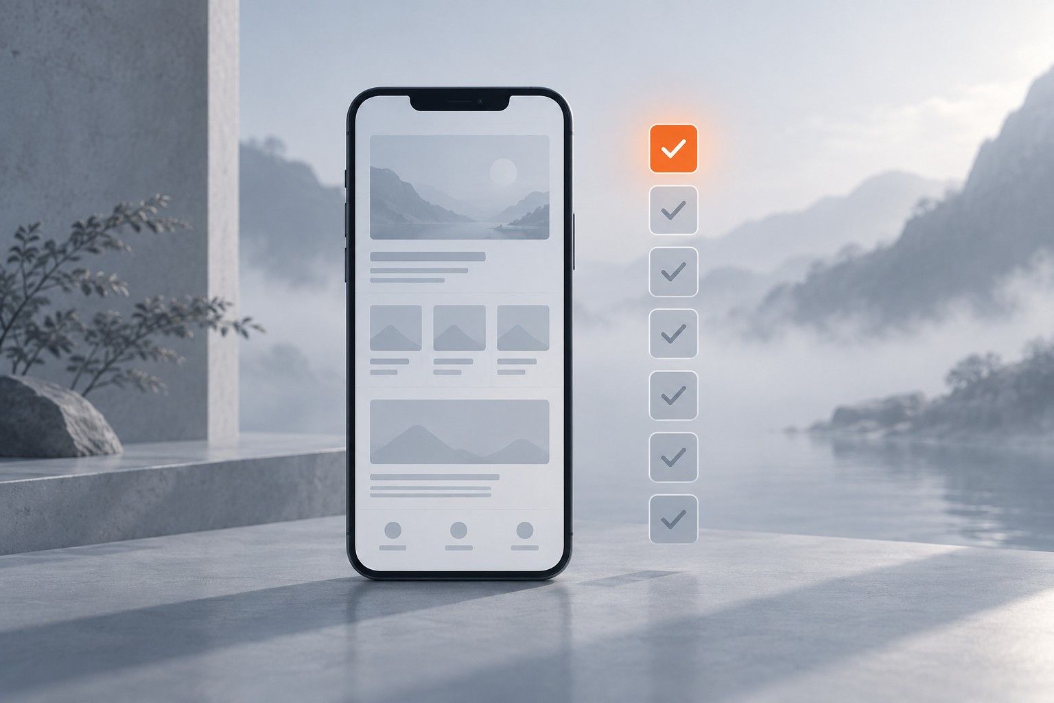
Pull out your phone. Open your website. Don't scroll. Just look. Here's what you need to see in that first screen:
1 A tap-to-call phone number
Not buried in a menu. Not at the bottom of the page. Right there. Big enough to tap with a thumb. This is the single most important thing on your mobile site.
2 A clear headline that says what you do
"Smith Plumbing - 24/7 Emergency Service" beats a fancy tagline every time. People need to know they're in the right place in one second.
3 A button or form to take action
"Get a Free Quote" or "Schedule Now." Something they can tap right away. You cannot make someone scroll to find how to contact you.
4 No giant hero image eating up the whole screen
A huge photo of a truck or a stock photo of a handshake pushes everything important below the fold. Keep images small or use them as a background.
The Real Problem: Nobody Checks Their Own Site on a Phone
I've been doing this since 2013. I've worked with over five thousand businesses. And the biggest thing I see on mobile websites is this: whoever built it doesn't think about above the fold.
They design the site on a big screen. It looks great on a 27-inch monitor. But then you open it on a phone and the first thing you see is a massive banner image, a hamburger menu, and nothing else.
No phone number. No call-to-action. No way to do anything without scrolling.
💡 Pro Tip
Here's what I tell every business owner: pull out your phone. Open your website. Set a timer for three seconds. If you can't find a way to call or contact you in three seconds? You're losing customers every single day.
Seventy Percent of Your Customers Never See Your Desktop Site
This isn't a guess. Google's data shows that over seventy percent of local searches happen on mobile devices. For service businesses - plumbers, HVAC, roofers, electricians - it's even higher.
That means seven out of ten people who find your business online are looking at the phone version. If you spent three thousand dollars on a beautiful desktop website but never checked it on a phone? You wasted most of that money.
70%+
of local service searches happen on phones
Source: Google / BrightLocal 2026
What to Do About It Today
You don't need to rebuild your whole website. You need to fix what shows up first. Here's the play:
- Run the three-second test. Open your site on your phone. Can you call or fill out a form in three seconds? If not, that's problem number one.
- Move your phone number to the top. Make it a sticky bar that stays on screen when people scroll. Tap to call. Always visible.
- Shrink your hero image. Your customers don't care about a photo of your truck. They care about getting help fast. Let the headline and button take center stage.
- Add a "Call Now" or "Get a Quote" button above the fold. Big. Bold. Can't miss it.
- Test on three different phones. Not just yours. Borrow a friend's. Try an older model. Screen sizes vary a lot.
This takes thirty minutes. And it can change everything about how many calls you get from your website.
| See What Customers See When They Find You Your website is often the first impression. We will show you what is working and what is not.
|
Written for contractors, not marketers. What is working in local search and AI right now, in five minutes. No fluff, no spam, unsubscribe anytime.
Connects to QuickBooks Online in one click. Your competitors ask 100% of customers for reviews automatically. Now you can too.
See How It WorksTake the free assessment and get a full report on where your marketing stands and what to fix first.
Start My Free Assessment